Wikipedia:Graphics Lab/Images to improve/Archive/Oct 2007
 | This page, part of the Graphics Lab Wikiproject, is an archive of requests for October 2007. Please do not edit the contents of this page. You can submit new requests here. |
 Done Amusement park icon
-

-
 I made a start on something, but couldn't get the background right.
 -
 modified OCAL image


Article(s): Various amusement park and roller coaster related articles and template.
Request: I'm looking for for an icon for the amusment park portal and other various templates. Initially, I thought the above image would look good upside-down (maybe with arms) but I'm very open to suggestions - ideally the outline of a roller coaster would be great but I understand that's a bit of a tall order! Seaserpent85Talk 15:25, 16 September 2007 (UTC)
Graphist opinion: I've made a start, but I'm not very good at this, and couldn't quite visualise the twisty tracks that should be visible in the top half of the icon. Or, for that matter, the tracks that should be visible in the gaps.Adam Cuerden talk 12:48, 17 September 2007 (UTC)
- Many thanks for the quick response! I do really like the style of what you've come up with, though I'm not sure it conveys that it's a roller coaster track rather than a train. As I said before I'm not really sure what I'm after, just an icon that you'd associate with being a roller coaster. Do you think the 2 images would look good combined? Seaserpent85Talk 15:48, 18 September 2007 (UTC)
If it's any help, I found an OpenClipart SVG that includes a roller coaster image. > Rugby471 talk ⚔ 17:27, 18 September 2007 (UTC)
- I had a quick go with the image from OCAL, (see Image:Roller_Coaster_Icon.svg but there are some fixes needed. --Dave the Rave (DTR)talk 18:27, 22 September 2007 (UTC)
- ...and I see Rugby made those fixes. Thanks a lot! --Dave the Rave (DTR)talk 19:13, 24 September 2007 (UTC)
- Many thanks for all the replies everyone. I like the look of the second one, however the colours are fairly strange! If the train and passengers could be coloured "realistically" then it would be brilliant! Thanks again, Seaserpent85Talk 18:42, 25 September 2007 (UTC)
- I tried changing the colours, but if I'm honest I think I might have made things worse. --Dave the Rave (DTR)talk 19:06, 26 September 2007 (UTC)
- Thanks for the heads up DTR. I do like the image and appreciate your hard work, the only concern I have is that it doesn't look too good when used as an icon - say 50px. I'm not sure what I'm asking for is actually achievable - ideally something related to the image I put up first. If that's too tall an order then not to worry, I'm grateful for everyones work! Many thanks, Seaserpent85Talk 14:45, 5 October 2007 (UTC)
- I tried changing the colours, but if I'm honest I think I might have made things worse. --Dave the Rave (DTR)talk 19:06, 26 September 2007 (UTC)
- Many thanks for all the replies everyone. I like the look of the second one, however the colours are fairly strange! If the train and passengers could be coloured "realistically" then it would be brilliant! Thanks again, Seaserpent85Talk 18:42, 25 September 2007 (UTC)

- ...and I see Rugby made those fixes. Thanks a lot! --Dave the Rave (DTR)talk 19:13, 24 September 2007 (UTC)
Yeah, I see what you mean. I've made the image smaller and tried to focus more on the train and occupants, so it should look better (although perhaps not perfect) at low res. And if I've been useless sorry about that, I am pretty useless. --Dave the Rave (DTR)talk 15:33, 5 October 2007 (UTC)
I have just added the heads from the Tango theme you specified earlier, is this any better ? (i could also try to do the same, but instead of just one expression, some more from the Tango smilies collection > Rugby471 talk ⚔ 17:00, 5 October 2007 (UTC)
- Definitely an improvement, I like it. However I still think it's a bit too complicated, maybe just have the yellow face with the arms, on the track made by Adam Cuerden (with a small box for the car). Again, apologies for being so picky! Thanks in advance, Seaserpent85 14:44, 7 October 2007 (UTC)
- Like this ? (Sorry if we went a bit off the plot before :-) ) > Rugby471 talk ⚔ 14:19, 14 October 2007 (UTC)
- Yeah, we do that sometimes. --Dave the Rave (DTR)talk 14:25, 14 October 2007 (UTC)
- That's perfect! Thanks very much for all of your hard work both of you, I'll mark this as Done :) Seaserpent85 15:12, 14 October 2007 (UTC)
- That's perfect! Thanks very much for all of your hard work both of you, I'll mark this as
- Yeah, we do that sometimes. --Dave the Rave (DTR)talk 14:25, 14 October 2007 (UTC)
- Like this ? (Sorry if we went a bit off the plot before :-) ) > Rugby471 talk ⚔ 14:19, 14 October 2007 (UTC)
Done Help?:)

Hello I am working on a ethnic wiki and I am writing on race and human body so I wonder if you can draw those breasts separately every each size you see on the picture I posted, very appreciate it and thanks in advance. Nick10000 15:59, 25 September 2007 (UTC)
Graphist's opinion It says, on the image tag, that you're the copyright holder, which makes your request a little strange. Can you clarify where the image came from? Adam Cuerden talk 21:45, 26 September 2007 (UTC)
- It came from myweb.dal.ca thanks again. --Nick10000 10:10, 29 September 2007 (UTC)
- The original image seems to have been deleted, so I'm marking this as "done" due to the request becoming obsolete. --Slashme 06:57, 16 October 2007 (UTC)
- It came from myweb.dal.ca thanks again. --Nick10000 10:10, 29 September 2007 (UTC)
Done Commonwealthery
-
To Help
-
 Attempt
 -
 Royal CoA
 -
 Scottish CoA
 -
 Another one


Article(s): Lord Protector and others
Request: While SVG would be ideal, anything would be better then the current image, especially in respect to the gryffin on the right-hand size which is extremely out of place, even when thumbnailed. 68.39.174.238 19:37, 30 September 2007 (UTC)
Opinion: I am not claiming this request, but the COA of the UK incorporates some of the elements of this one. Maybe it will help. > Rugby471 talk ⚔ 16:35, 1 October 2007 (UTC)
- I'd like to hold back too, for the moment, but [1] might be useful. --Dave the Rave (DTR)talk 16:52, 1 October 2007 (UTC)
- I will try this one. Chabacano 00:47, 2 October 2007 (UTC)
- Done. is it ok? Chabacano 00:29, 3 October 2007 (UTC)
- That looks very okay, if you ask me. --Dave the Rave (DTR)talk 17:36, 3 October 2007 (UTC)
- I agree, very nice > Rugby471 talk ⚔ 17:38, 3 October 2007 (UTC)
- That looks very okay, if you ask me. --Dave the Rave (DTR)talk 17:36, 3 October 2007 (UTC)
- Done. is it ok? Chabacano 00:29, 3 October 2007 (UTC)
- I will try this one. Chabacano 00:47, 2 October 2007 (UTC)
- That's an AMAZZING work; if I file a request for you to replace the Royal coat of arms (The 2nd one in the gallery), would you be willing to? That's one of the most visible Crown Copyrighted images that could be replaced with a free SVG... 68.39.174.238 21:42, 4 October 2007 (UTC)
- Thanks! I did this request as well. Doing these was fun :) Chabacano 23:59, 5 October 2007 (UTC)
- Wow, these truly are amazing! By the way, if you'd like to do more, there's always the Scottish one too, plus of course a whole bunch of variations listed on Royal coat of arms of the United Kingdom and related articles... —Ilmari Karonen (talk) 13:35, 7 October 2007 (UTC)
- Scottish done :) I think that I am going to stop doing variations of this CoA for some time, too much lions and unicorns. Chabacano 07:55, 8 October 2007 (UTC)
- Wow, thanks, that was fast! Anyway, I'd just like to note that it seems you forgot to change the quartering... —Ilmari Karonen (talk) 17:57, 8 October 2007 (UTC)
- Quartering ? > Rugby471 talk ⚔ 18:44, 8 October 2007 (UTC)
- Ooops. Fixed. He meant the four quarters of the smaller CoA in the center of the big thing. I forgot that. Chabacano 19:34, 8 October 2007 (UTC)
- You deserve a barnstart for that. Also, if you feel like more (later obviously, I read your comment above) you can try the Canadian ones. Nunavut has a caribou and narwhal ;) 68.39.174.238 21:56, 8 October 2007 (UTC)
Done Flag of Thailand
-

-
Colours and size changed

Article(s): Flag of Thailand, Thailand, etc.
Request: The current flag colours don't represent the Thai flag properly (See Talk:Thailand#Flag - color is poor and Commons:Image talk:Flag of Thailand.svg). There are no official specifications for colours of the Thai flag other than red white and dark blue, but altering the flag colours to those of Image:Flag of the United Kingdom.svg should be close enough. Also, reducing the default size to something not so overwhelming when viewed in Firefox with 1024*768 resolution would be nice. -- Paul_012 (talk) 13:23, 3 October 2007 (UTC)
Graphist opinion: I've uploaded it separately so it won't get reverted immediately. How's this ? > Rugby471 talk ⚔ 15:55, 3 October 2007 (UTC)
- That's great, though upon further inspection I feel the red could still be brighter (thinking along the lines of this page). My monitor's calibration is too bad to judge precisely though. Paul_012 (talk) 19:58, 4 October 2007 (UTC)
- I made it brighter, how's this ? > Rugby471 talk ⚔ 07:35, 5 October 2007 (UTC)
- Yes, I think we can upload this version over the old name. Thanks a lot! Paul_012 (talk) 17:26, 5 October 2007 (UTC)
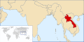
Done Thailand locator map
-
 Current locator map for Thailand
 -
 Correct Location ?
 -
 Thailand
 -
 Cambodia
 -
 Burma
Burma -
 Laos
Laos -
 Vietnam
 -
 Better?


Article(s): Thailand
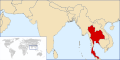
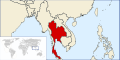
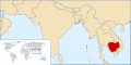
Request: Thailand is usually geographically and politically grouped within the Southeast Asia subregion, therefore I believe a locator map featuring Thailand's ___location within Southeast Asia would be more suitable and familiar. Also, the current map was taken from a map of the entire Earth, and though the country's tropical ___location lessens the effect, quite obvious skewing due to the map centre being far to the west is plainly visible. (A map based on a regional projection would be favorable, but this may be difficult to achieve given the current blank maps available on Commons.) The same would also apply for maps of Laos, Burma (Myanmar), Cambodia and Vietnam -- Paul_012 (talk) 14:31, 3 October 2007 (UTC)
Graphist opinion: Is this the ___location you were more looking for ? > Rugby471 talk ⚔ 14:10, 4 October 2007 (UTC)
- Agree with nom, rugby's perspective looks good, also, useful for countries like Burma, Laos, Vietnam, Cambodia which all use the same perspective, but are geographically within southeast Asia. aliasd·U·T 14:36, 4 October 2007 (UTC)
- I can pick this one up over the weekend if nobody attacks it sooner. aliasd·U·T 14:49, 4 October 2007 (UTC)
- Yes, that projection is very okay indeed. Paul_012 (talk) 20:04, 4 October 2007 (UTC)
- Finished it, but it seems fit page to selection doesn't work after my last inkscape upgrade... weird! aliasd·U·T 12:03, 6 October 2007 (UTC)
- Yes, that projection is very okay indeed. Paul_012 (talk) 20:04, 4 October 2007 (UTC)
- I can pick this one up over the weekend if nobody attacks it sooner. aliasd·U·T 14:49, 4 October 2007 (UTC)
- Just set the page size, manually. > Rugby471 talk ⚔ 12:23, 6 October 2007 (UTC)
- Stupid me didn't realise there was a manditory doc size :( redoing aliasd·U·T 13:42, 6 October 2007 (UTC)
- Is this good, or would we be better off "zooming out"? aliasd·U·T 04:39, 7 October 2007 (UTC)
- Well, I would have preferred maps based on the second image by Rugby471 (less distortion) but those are improvements anyway. Burma/Myanmar is cropped off at the top, and Thailand's south is almost touching the edge, so I'd suggest zooming out a bit if we're going to use these ones. (Or making individual crops for each, but that would be excessive work.) Paul_012 (talk) 09:21, 7 October 2007 (UTC)
- I did attempt to create some based on Rugby's projection, look at the revision history of any of my images, but they have to be 2:1 to work with the country infobox sadly :( aliasd·U·T 14:42, 7 October 2007 (UTC)
- How about this? aliasd·U·T 15:05, 7 October 2007 (UTC)
- Sorry, I've been away; that looks fine to me, anyway. Paul_012 (talk) 11:58, 14 October 2007 (UTC)
Done Papua New Guinea Coat of Arms
-
Okay?
Article(s): Papua New Guinea (see article for blotchy gif resizing goodness) and many others on numerous projects
Request: This is a horribly small and low quality gif image that doesn't resize well. I have attempted a svgify of this a couple times, but feel I probably can't make a derivative work of it due to licencing, and I have found recreating difficult. aliasd·U·T 14:46, 4 October 2007 (UTC)
- Comment: Vector-images.com pics have been here before, and I think that you're in the clear as far as licensing is concerned as long as you base work on a raster preview image, like this one. See Wikipedia:Graphic_Lab/Images_to_improve/Archive/Aug_2007#Coat_of_arms_of_Laos in the archives.
Graphist opinion: I've reuploaded the image in PNG form. Does using that image solve the resizing problems? CountingPine 01:15, 5 October 2007 (UTC)
- It does, but would still be nice to see this as a vector. aliasd·U·T 03:45, 5 October 2007 (UTC)
I'm 3/4 through the SVG, bear with me ... > Rugby471 talk ⚔ 15:23, 5 October 2007 (UTC)
- I'm done ! The only thing I need to do now is the extra detail (the feathers). But so far, is this okay ? > Rugby471 talk ⚔ 16:16, 5 October 2007 (UTC)
- ... and the text... --Dave the Rave (DTR)talk 16:33, 5 October 2007 (UTC)
- Oh. Is that actually part of the COA ? I thought it had been added as decoration while on vector-images.com > Rugby471 talk ⚔ 16:48, 5 October 2007 (UTC)
- Oh, I see what you mean. Yeah, I think you're right. It's not on here. --Dave the Rave (DTR)talk 16:55, 5 October 2007 (UTC)
- Oh. Is that actually part of the COA ? I thought it had been added as decoration while on vector-images.com > Rugby471 talk ⚔ 16:48, 5 October 2007 (UTC)
I went ahead an put in the feathers anyway. How is it ? > Rugby471 talk ⚔ 18:49, 5 October 2007 (UTC)
- Awesome work! This one is done! aliasd·U·T 02:17, 6 October 2007 (UTC)
- I wish I had thought of the banknotes when I was trying to reconstruct :( aliasd·U·T 02:22, 6 October 2007 (UTC)
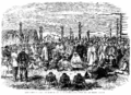
Done Stitching
- Image:1863 Meeting of Settlers and Maoris at Hawke's Bay, New Zealand - Left.png
- and Image:Waikato - 002a.PNG
-
 by Ilmari Karonen

Yeah, I messed up that title.
Request: Anyway, can you stitch it together and fix the tilt? I'd like to have a copy of the full-sized stitch, if possible, but it'll probably have to be converted to jpg or shrunk in order to show anywhere on Wikipedia. Adam Cuerden talk 04:29, 5 October 2007 (UTC)
Graphist opinion: How's this ? > Rugby471 talk ⚔ 14:11, 5 October 2007 (UTC)
- There's an awful lot of Moiré in the sky. Now, I know the sky wasn't that good even in the original printing (one of the reasons I wanted a full-sized version was to try and fix the sky), but it seems a little excessive. Adam Cuerden talk 19:19, 5 October 2007 (UTC)
- Here's my take, how's that? I stitched it at the maximum size supported by Wikipedia, since I didn't notice you asked for full size, but I can easily redo it at a larger size (hugin suggests 8353×5986) if you want. By the way, I'm not sure if you've noticed already, but there's some pretty obvious blurring along a horizontal line near the top right of the left image. Looks like another paper slip or scanner error to me, fortunately it didn't affect the stitching much. —Ilmari Karonen (talk) 22:37, 5 October 2007 (UTC)
- I think I've figured out what those are, by the way: The top part of the scasnner isn't pushign the paper flat enough. I've been putting a book atop the paper. But the sky on these was already pretty bad, due to printing errors in this copy, so I'll just fix that when I fix the sky. E-mail me the big one? I'll send you a e-mail. Adam Cuerden talk 02:31, 6 October 2007 (UTC)
- Nah, I just uploaded it as Image:1863_Meeting_of_Settlers_and_Maoris_at_Hawke's_Bay,_New_Zealand large.png. —Ilmari Karonen (talk) 03:21, 6 October 2007 (UTC)
- I think I've figured out what those are, by the way: The top part of the scasnner isn't pushign the paper flat enough. I've been putting a book atop the paper. But the sky on these was already pretty bad, due to printing errors in this copy, so I'll just fix that when I fix the sky. E-mail me the big one? I'll send you a e-mail. Adam Cuerden talk 02:31, 6 October 2007 (UTC)
- Here's my take, how's that? I stitched it at the maximum size supported by Wikipedia, since I didn't notice you asked for full size, but I can easily redo it at a larger size (hugin suggests 8353×5986) if you want. By the way, I'm not sure if you've noticed already, but there's some pretty obvious blurring along a horizontal line near the top right of the left image. Looks like another paper slip or scanner error to me, fortunately it didn't affect the stitching much. —Ilmari Karonen (talk) 22:37, 5 October 2007 (UTC)
- Oh, sorry, I didn't see you wanted a full size version. I'll leave to Ilmari though, he's more experienced with Hugin than I am > Rugby471 talk ⚔ 07:02, 6 October 2007 (UTC)
- Sorry! I forgot to thank you and mark this as done - I've been quietly editing the image in the background. It's nearly done now, but... well, never mind. Thanks a lot! Adam Cuerden talk 16:16, 13 October 2007 (UTC)
Done SVG of Plimsoll line


Articels: Plimsoll line and others.
Request: SVGification 68.39.174.238 20:06, 12 October 2007 (UTC)
Opinion: Done, how's this > Rugby471 talk ⚔ 08:06, 13 October 2007 (UTC)
- Looks fine. 68.39.174.238 13:33, 13 October 2007 (UTC)
Done Crop out the Logo of Deutsches Jagd- und Fischereimuseum
-
 Okay?
Okay?
Article(s):
Request: Please crop it out towards a round image-- Scriberius 21:52, 12 October 2007 (UTC)
Graphist opinion: Done, how's this? > Rugby471 talk ⚔ 07:22, 13 October 2007 (UTC)
- Looks good - thanks! --Scriberius 16:46, 13 October 2007 (UTC)
Done Perspective correction, possibly a trim
-
 Somewhat distorted; distracting background from the rest of the book.
 -
 An attempt at correcting the distortion (GIMP, "curve bend" filter); crop.


Article(s):
Request: Unless you think that this presentation adds something significant, could you do a perspective correction and extract just the actual article? Thanks! Adam Cuerden talk 16:20, 13 October 2007 (UTC)
Graphist's opinion:
- Someone else will have to do this one; I don't think I can persuade hugin to do anything useful to the distortion on the right, nor do I have any other software that could fix it. —Ilmari Karonen (talk) 05:32, 15 October 2007 (UTC)
- I'll give it a bash. --Slashme 05:37, 15 October 2007 (UTC)
- OK, I gave it my best shot. Not perfect, but better.--Slashme 07:47, 15 October 2007 (UTC)
- Not bad! Nice work! Adam Cuerden talk 12:43, 16 October 2007 (UTC)
- Thanks! --Slashme 13:02, 16 October 2007 (UTC)
Done Image:Three Gorges Dam.jpg
-
 Colours the same now

Article(s): Three_Gorges_Dam
Request: Hello Wikigraphists ! I came to the Three Gorges Dam article after seeing the current main page's news about the ongoing ecological disaster in this area. I then found this image, which may be more valuable if the both component images (1987 & 2007 images) had the same happy colors. So, the request is to :
- improve the colors of this images, especially the 1987's one, and...
- to harmonized the both photo colors.
Many thanks to you ! -- Lyhana8 17:57, 14 October 2007 (UTC)
Graphist opinion:
I could try to improve the images, but i wouldn't know how to give them a similar colouring 'scheme', perhaps using palettes or something ? Is what I said before I worked out how to do it, I created an image with two layers, on the top the greenish image, the bottom, the purple-ish image. I set the top layer to 'Color' in the layers dialog and lowered the opacity a bit. (all done in GIMP). If anyone wants to improve the colours from here be my guest, at least now both images are at a common starting point. How is it ? > Rugby471 talk ⚔ 18:55, 14 October 2007 (UTC)
- I've reuploaded a version with slightly fewer color artifacts. What I did was take the difference of the two images and apply, after levels changes, as a layer mask for the recoloring. That way, areas with large changes in intensity didn't get (incorrectly) recolored. I also resynthesized away the scale marked in the corner of the upper image first. —Ilmari Karonen (talk) 05:28, 15 October 2007 (UTC)
- Both versions have some problems, though. In particular, the recoloring method emphasizes the parts of the rivers in the 1987 version that are under the dam lake in the 2007 version, which in some ways affects the factual accuracy of the image. It might be preferable to try to match the colors using only global adjustments instead. In the end, I'm not sure how closely that can be done without introducing serious distortion: the fact remains that one of the photos was taken in April and the other in November, so one can't really expect the colors of the vegetation to match. —Ilmari Karonen (talk) 09:32, 15 October 2007 (UTC)
- Many thanks to both of you for your time and work ! That's better. The bottom one is still more "white" than the top one, but that can be because os real-world seasons (one picture take in april, the other in september). So thanks work the work done. -- Lyhana8 17:24, 15 October 2007 (UTC) —Preceding unsigned comment added by 210.203.52.130 (talk)
Done Image:DykeMarchToronto.jpg
-
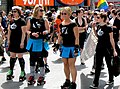 Cropped out advertisements and bystander, improved contrast.

Article(s): Dyke March
Request: -- Hi, please crop image from top down midway through the business advert signs (like right below the "zz"'s in the words pizza pizz) this will obscure the phone number and signs a bit. also crop from the left side eliminating th person with their back to the veiwer and the additional business sign. Then could the whole picture quality be amped a bit to provide some definition and contrast? This is, as of yet, the only phtot for the article that was just added today so I'd love for it to have improved quality. Thank you!!! Benjiboi 22:02, 14 October 2007 (UTC)
Graphist opinion:
- Is this what you had in mind? I prefer the composition without cropping (mostly because the whole gay flag is still included, and the subjects are not staring at the edge of the photo), but the blur is a bit distracting, I guess. --Slashme 08:18, 15 October 2007 (UTC)
- The second one is exactly what I was hoping for! The blurs are a bit odd but so was the giant phone number. Thank you so much! Benjiboi 08:24, 15 October 2007 (UTC)
- Glad you like it! --Slashme 08:36, 15 October 2007 (UTC)
Done Image:Gw_donkeykong.PNG
Article(s): Todays featured article Donkey Kong
Request: Quickly clean up this image's background, this ugly image being in the main page today !!! -- Lyhana817:21, 15 October 2007 (UTC)
Graphist opinion:
This Good ? > Rugby471 talk ⚔ 18:19, 15 October 2007 (UTC)
Couldn't was protected oh well. Maybe an admin can ? > Rugby471 talk ⚔ 19:01, 15 October 2007 (UTC)
- Done.Geni 20:29, 15 October 2007 (UTC)
- Congratulation ! This clean up was visible 3 hours and 31 minutes on the main pages, and many readers have probably notice the change ;). Such visible actions are especially welcome !
- But I'm a bit worry : How many wikigraphists are also admin on commons ?? We need 3 at least... Yug 05:29, 16 October 2007 (UTC)