Wikipedia:Graphics Lab/Illustration workshop
This page is deprecated and will not be monitored. Please use one of the three workshop pages. This specific page is {{{1}}}
See also
- Category:Images for cleanup
- Category:Images for redraw
- meta:Philip Greenspun illustration project/Requests
Request: Hello, it's map, please :
- Please , Thank you ! Cancelos (talk) 12:31, 20 April 2008 (UTC)
Graphist opinion: So you want this to be made into a vector and uploaded to Wikipedia for the Pêra Rocha article? James1293 (talk) 19:47, 30 April 2008 (UTC)
- For english and portuguese article, a map of production , please , Cancelos (talk) 20:44, 1 May 2008 (UTC)
DPRK's coat of arms
-
I kinda started on it a while ago
Article(s): Lots of articles
Request: SVG the coa of North Korea please. Thanks --SelfQ (talk) 13:25, 15 April 2008 (UTC)
Graphist opinion:
- I gave it a stab months ago, just gave up. User:Zscout370 (Return Fire) 03:00, 30 April 2008 (UTC)
- Anyone wish to continue?--SelfQ (talk) 12:04, 30 April 2008 (UTC)
- I might do a little...? James1293 (talk) 19:37, 30 April 2008 (UTC)
- Please go ahead. --SelfQ (talk) 21:27, 30 April 2008 (UTC)
- I might do a little...? James1293 (talk) 19:37, 30 April 2008 (UTC)
Al Anbar Governorate
Article(s): Al Anbar Governorate
Request: use same font -- Chris (クリス • フィッチ) (talk) 05:06, 19 April 2008 (UTC)
- Would it be worth it to just request SVGification, or are the borders too messy for that? 68.39.174.238 (talk) 02:12, 2 May 2008 (UTC)
Graphist opinion:
US military bases in the world 2007
-

-
 royal blue
 -
 paler blue
 -
 orange
 -
 SVGMore than 1000 US troopsMore than 100 US troopsUse of military facilities


Article(s): List of United States military bases
Request: change to white background for legibility -- Chris (クリス • フィッチ) (talk) 05:06, 19 April 2008 (UTC) (ps-adding that this should be SVG and use an improved color scheme)
Graphist opinion: Done. Not really an improvement—this should be SVG and use an improved color scheme. Maybe I'll get around to it ;) Fvasconcellos (t·c) 14:28, 19 April 2008 (UTC)
- You're right, some of those islands where there are bases totally fade out. Thank you for thus far, and hoping you'll go farther! Chris (クリス • フィッチ) (talk) 15:17, 19 April 2008 (UTC)
- If someone can put together the data (i.e. which country which colour) then I can create an svg in a few minutes. Hunting through the 11 sources for that info is not something I'm prepared to do though. /Lokal_Profil 19:39, 19 April 2008 (UTC)
+1000
Afghanistan
Azores
Bahrain
Bermuda
Belgium
Bosnia
Bulgaria
Canaries
Diego Garcia
Djibouti
Germany
Great Britain
Guantanamo Bay
Iceland
Iraq
Italy
Japan
Jordan
Kuwait
Kyrgyzstan
Oman
Portugal
Romania
Serbia
South Korea
Spain
Turkey
UAE
US
+100
Albania
Australia
Canada
Croatia
Colombia
Dominican Republic
Egypt
El Salvador
Georgia
Greece
Greenland
Hungary
Macedonia
Nicaragua
Paraguay
Peru
Philippines
Saudi Arabia
Singapore
Thailand
facility use
Azerbaijan
Czech Republic
Ecuador
Indonesia
Kazakhstan
Kenya
Luxembourg
Malaysia
Morocco
Netherlands
Norway
Pakistan
Panama
Poland
Senegal
Somalia
Tajikistan
Turkmenistan
- (What does everyone think a better color scheme would be?) Chris (クリス • フィッチ) (talk) 01:30, 21 April 2008 (UTC).
- I'd go with a sort of royal blue for >1000, paler blue for >100, and a shade of orange for contrast. It's pretty "classic" and perfectly colorblind compliant. Fvasconcellos (t·c) 01:52, 21 April 2008 (UTC)
- Were these similar to the shades you had in mind? Chris (クリス • フィッチ) (talk) 02:33, 21 April 2008 (UTC)
- Pretty much, and thanks for the data. If Lokal profil doesn't get around to it tomorrow, I can do it when I get to my other computer :) Fvasconcellos (t·c) 03:22, 21 April 2008 (UTC)
- I'm short on time for the moment so go ahead =). If you use the SVG world map then all you need to do is to list the relevant iso codes using a text editor, see Image:Map of unitary and federal states.svg for an example. /Lokal_Profil 18:32, 27 April 2008 (UTC)
- Excellent. I'm almost done; I can't get the third set of countries to work (must have screwed up some bit of code :), but I'll upload it as soon as it's sorted out. Fvasconcellos (t·c) 23:09, 29 April 2008 (UTC)
- If you can't get it to work you can always upload it as is and I'll se if I can figure out what's wrong. /Lokal_Profil 15:11, 11 May 2008 (UTC)
- I think I'll do just that :( Fvasconcellos (t·c) 19:35, 20 May 2008 (UTC)
- Upped a new version. Which was the source for the liste of countries above (so that I can enter it into the image page). /Lokal_Profil 19:38, 20 May 2008 (UTC)
- Sorry, missed your reply whilst I created the map. /Lokal_Profil 19:44, 20 May 2008 (UTC)
- Please, don't apologize; this was long, long overdue. I'm only annoyed at my inability to make it work! I'm usually at least somewhat competent with SVG code :P Fvasconcellos (t·c) 19:53, 20 May 2008 (UTC)
- Sorry, missed your reply whilst I created the map. /Lokal_Profil 19:44, 20 May 2008 (UTC)
- Upped a new version. Which was the source for the liste of countries above (so that I can enter it into the image page). /Lokal_Profil 19:38, 20 May 2008 (UTC)
- I think I'll do just that :( Fvasconcellos (t·c) 19:35, 20 May 2008 (UTC)
- If you can't get it to work you can always upload it as is and I'll se if I can figure out what's wrong. /Lokal_Profil 15:11, 11 May 2008 (UTC)
- Excellent. I'm almost done; I can't get the third set of countries to work (must have screwed up some bit of code :), but I'll upload it as soon as it's sorted out. Fvasconcellos (t·c) 23:09, 29 April 2008 (UTC)
- I'm short on time for the moment so go ahead =). If you use the SVG world map then all you need to do is to list the relevant iso codes using a text editor, see Image:Map of unitary and federal states.svg for an example. /Lokal_Profil 18:32, 27 April 2008 (UTC)
- Pretty much, and thanks for the data. If Lokal profil doesn't get around to it tomorrow, I can do it when I get to my other computer :) Fvasconcellos (t·c) 03:22, 21 April 2008 (UTC)
Oil palm

Article(s): Oil Palm
Request: carefully fix minor halftoning [this is at 400 dpi, and I think all that's needed is a slight blur, and maybe a sharpen after.], fix edges. These are the natural colours, I believe, except maybe that funny pink in the title at the top. Shoemaker's Holiday (talk) 15:48, 19 April 2008 (UTC)
- I'll get this with a Fourier transform as soon as I can (it preserves a bit more high frequency than a blur). Time3000 (talk) 16:55, 20 April 2008 (UTC)
- I am getting there, but it's a bit slow going because the image is so huge. Time3000 (talk) 11:52, 5 May 2008 (UTC)
Hail to the Chief


Article(s): Hail to the Chief
Request: trim out or clean off beige spraypaintry -- Chris (クリス • フィッチ) (talk) 07:30, 20 April 2008 (UTC)
Graphist opinion: Is this okay? miranda 05:13, 27 April 2008 (UTC)
- Sorry for being unclear. The point is to get the beige off, even if the image has to be greyscaled. Chris (クリス • フィッチ) (talk) 05:33, 27 April 2008 (UTC)
- In light of the new info, how's that? §hep • ¡Talk to me! 01:35, 30 April 2008 (UTC)
- Wonderful, please overwrite original, thanks! Chris (クリス • フィッチ) (talk) 04:56, 30 April 2008 (UTC)
- Can't, I saved it as a PNG which is superior to a GIF. §hep • ¡Talk to me! 19:39, 30 April 2008 (UTC)
- Ah, thanks, sorry, please mark the original vva, thanks! Chris (クリス • フィッチ) (talk) 01:39, 1 May 2008 (UTC)
- I have uploaded a new version of this (a little late, I know); rather than taking the grayscale average, I just took the blue channel - which was least affected by the beige. I have marked the original as superseded. Mine is uploaded to Commons - the name clashes, so follow this link to see it: [1]. CountingPine (talk) 01:13, 10 May 2008 (UTC)
- Would the next step involve transcribing it in GNU LilyPond? --Damian Yerrick (talk | stalk) 15:23, 14 May 2008 (UTC)
- I'm sorry, don't know what that is. :( Chris (クリス • フィッチ) (talk) 01:00, 19 May 2008 (UTC)
- It's a program for writing sheet music, theoreticaly it also outputs svg but in reality only the png output is usable. /Lokal_Profil 19:46, 20 May 2008 (UTC)
- I'm sorry, don't know what that is. :( Chris (クリス • フィッチ) (talk) 01:00, 19 May 2008 (UTC)
Waffen-SS unit insignia
-
Collage of SS collar patches
Article(s): SS unit insignia
Request: Could someone make individual SVG patches out of this? also, can someone make out some of the text? Thanks --SelfQ (talk) 23:31, 20 April 2008 (UTC)
Graphist opinion:
- Those words are division numbers. It seems that we have all the insignia for Waffen-SS divisions, but not collar patches. Renata (talk) 17:08, 21 April 2008 (UTC)
- My bad. I was thinking collar patches but didnt type it. fix'ed.--SelfQ (talk) 19:57, 21 April 2008 (UTC)
- Looking at the Waffen-SS pics, could they be SVG or is there a law thingy prohibiting it? Mangwanani (talk) 18:24, 22 April 2008 (UTC)
- Most Waffen-SS images and symbols are public ___domain, and the legal thingy is only for Germany, and since wikipedia is not hosted in Germany I dont think there is a problem, right?--SelfQ (talk) 19:45, 23 April 2008 (UTC)
- Looking at the Waffen-SS pics, could they be SVG or is there a law thingy prohibiting it? Mangwanani (talk) 18:24, 22 April 2008 (UTC)
- My bad. I was thinking collar patches but didnt type it. fix'ed.--SelfQ (talk) 19:57, 21 April 2008 (UTC)
- I'm pretty sure that law is for noneducational use. 68.39.174.238 (talk) 21:17, 24 April 2008 (UTC)
- So it can be done right?--SelfQ (talk) 16:35, 29 April 2008 (UTC)
- I'm pretty sure that law is for noneducational use. 68.39.174.238 (talk) 21:17, 24 April 2008 (UTC)
- I'm no lawyer, but I don't think German laws apply to us... 68.39.174.238 (talk) 19:14, 7 May 2008 (UTC)
- As long as you add {{Nazi_symbol}} to the image page it's ok to upload them. /Lokal_Profil 19:48, 20 May 2008 (UTC)
- I'm no lawyer, but I don't think German laws apply to us... 68.39.174.238 (talk) 19:14, 7 May 2008 (UTC)
Northwest Territories License Plate


Article(s): U.S. and Canadian license plates
Request: trim out for clear background, replace bolts with empty boltholes -- Chris (クリス • フィッチ) (talk) 04:18, 22 April 2008 (UTC)
Graphist opinion: Done, but removed bolt-holes completely (irrelevant and distracting). Saved as png to allow transparency. Please mark as resolved if this is OK. --Slashme (talk) 10:40, 9 May 2008 (UTC)
- Sorry for the delay, I'm just getting settled in Japan. Great job, however I did not notice on the original photo that the blue-and-white edge was trimmed off, is there anyway to recreate that? Thanks! Chris (クリス • フィッチ) (talk) 01:04, 19 May 2008 (UTC)
OFCCP Seal
-
 Seal of OFCCP
 -
 SVG version
 -
 SVG with redone letters


Article(s): Office of Federal Contract Compliance Programs
Request:
- Redraw the circles.
- Redo the text
- Redraw the eagle and shield if possible (if not that's okay
Image not available electronically, but scanned from an older document. Thanks. --evrik (talk) 19:25, 23 April 2008 (UTC)
Graphist opinion: Here is the SVG version, does it need any colours -- Cradel 13:38, 24 April 2008 (UTC)
- The circle and all in it will need to be white and the writing could be typed out rather than traced. Mangwanani (talk) 14:53, 24 April 2008 (UTC)
- The circle in is white but i only traced the letters-- Cradel 15:09, 24 April 2008 (UTC)
- Black and white is fine. Would it be possible to type out the letters so they come out cleaner? Also, is there any way to sharpen the lines on the eagle and shield? Many thanks! --evrik (talk) 19:17, 24 April 2008 (UTC)
- My monitor shows the transparency. That's what I meant by white. Mangwanani (talk) 15:42, 25 April 2008 (UTC)
- Actually there was a background but I forgot to change the opacity, anyway I fixed it now -- Cradel 22:04, 25 April 2008 (UTC)
- I took a shot at redoing the letters; not sure if they feel like they match the eagle but you can use it if you think it's better. The eagle was taken directly from Cradel's version... doing any better with that is well beyond me. Carl Lindberg (talk) 07:12, 27 April 2008 (UTC)
- My monitor shows the transparency. That's what I meant by white. Mangwanani (talk) 15:42, 25 April 2008 (UTC)
- Black and white is fine. Would it be possible to type out the letters so they come out cleaner? Also, is there any way to sharpen the lines on the eagle and shield? Many thanks! --evrik (talk) 19:17, 24 April 2008 (UTC)
- The circle in is white but i only traced the letters-- Cradel 15:09, 24 April 2008 (UTC)
- Well, unless someone wants to take a crack at cleaning up the eagle pixel by pixek, I think it looks much better. Thank you, all. --evrik (talk)
I hate to say it, but that may be the end result: It's impossible to tell what the eagle's holding, or what's on the shield. 68.39.174.238 (talk) 16:14, 9 May 2008 (UTC)
- Looks like a fairly standard federal eagle... spade shaped shield (similar to the presidential seal) with three stars and stripes, holding an olive branch and three arrows. We would still have to guess at the details though so unless we find a better version to work off of, this is probably good. Carl Lindberg (talk) 05:37, 11 May 2008 (UTC)
- I supposed we can't have everything, like we did with the Congress coats request ;). 68.39.174.238 (talk) 21:39, 17 May 2008 (UTC)
Hermann Göring
-

-
conceivably this could also be used, but there's a color reversal in the middle
.jpg)
Article(s): Hermann Göring
Request: fix glare, even out coloration -- Chris (クリス • フィッチ) (talk) 05:39, 24 April 2008 (UTC)
Graphist opinion: This is not as easy as one might think. It's really hard to fix glare; you have to basically re-draw the area using "cheating" tools like the clone brush. A perfect example of things that should have been fixed by taking a better photo. If this remains stale, I'll take a look at it sometime. --Slashme (talk) 11:17, 9 May 2008 (UTC)
- Could it be vectorized, or is that more trouble than its worth? 68.39.174.238 (talk) 16:12, 9 May 2008 (UTC)
- This can be done. It won't look perfect, but I'll give it a shot. Not today though, don't have time :/ XcepticZP (talk) 00:20, 13 May 2008 (UTC)
World 820

Article(s): History of Tibet
Request: put on regular Wiki-style white or clear background -- Chris (クリス • フィッチ) (talk) 05:39, 24 April 2008 (UTC)
- And change Tauregs to Tuaregs. --ANONYMOUSPUSSY 16:55, 3 May 2008 (UTC)
- Shouldn't it be spelled "Caliphate" ? 68.39.174.238 (talk) 23:58, 9 May 2008 (UTC)
- It should indeed be spelled "Caliphate". Chris (クリス • フィッチ) (talk) 01:07, 19 May 2008 (UTC)
Graphist opinion:
Burmese language requests
-

-
#1 someone please delete this incorrect and unsightly version
-
 #2 From font-closest to needed
 -
 #3 Other Version-also good


Article(s): all sorts of Burmese language requests
Request: SVGify -- Chris (クリス • フィッチ) (talk) 03:59, 25 April 2008 (UTC)
Graphist opinion: There was already an SVG version in use, but it looked traced. Rather than overwrite it, I uploaded a new one converted from a unicode font with burmese characters in it — ₪₪ ch1902 ₪₪ 10:56, 25 April 2008 (UTC)
- I also created one based on the jpg with Inkscape-- Cradel 10:59, 25 April 2008 (UTC)
- I'd go with yours, that font did not scale up at all well! — ₪₪ ch1902 ₪₪ 11:49, 25 April 2008 (UTC)
- Please overwrite what I have labeled #1 with the much better #2, thanks! Chris (クリス • フィッチ) (talk) 13:57, 25 April 2008 (UTC)
- I don't think we can overwrite since the images have different licenses (I don't think you can put a license on letters and geometric shapes...) can't we just use #2 with the existing name? — ₪₪ ch1902 ₪₪ 17:07, 29 April 2008 (UTC)
- The thing is, #1 is absolutely horrible wrong, it needs to be either deleterd or overwritten. If overwritten, the licenses can also be overwritten very easily. It needs to go, it is incorrect and has no place on the 'pedia. Chris (クリス • フィッチ) (talk) 04:53, 30 April 2008 (UTC)
- I've filed for the 1st one (The traced one) to get removed on Commons. 68.39.174.238 (talk) 23:55, 9 May 2008 (UTC)
- Someone want to comment here on #1? 68.39.174.238 (talk) 17:36, 19 May 2008 (UTC)
weird question?


Article(s):
Request: Does Wikipedia have, or is it possible to develop through coding or elsewise, a customizable [[Image:___|200px|thumb]] type box for odd-shaped pictures like the one above? -- Chris (クリス • フィッチ) (talk) 03:59, 25 April 2008 (UTC)
Graphist opinion: According to me (and Wikipedia:Picture tutorial): unfortunately not. --ANONYMOUSPUSSY 09:24, 25 April 2008 (UTC)
- the white space could be made transparent, if saved to a different format Thisglad (talk) 09:27, 25 April 2008 (UTC)
- Would someone be willing to make a transparent-space version of this? Thanks! Chris (クリス • フィッチ) (talk) 13:59, 25 April 2008 (UTC)
- I forget what all formats hold a transparent, so made it a GIF for now. Sorry the cut's not perfect, that's the best I got. §hep • ¡Talk to me! 05:30, 26 April 2008 (UTC)
- Would someone be willing to make a transparent-space version of this? Thanks! Chris (クリス • フィッチ) (talk) 13:59, 25 April 2008 (UTC)
- Thanks! Would a PNG be preferable for this kind of an image? Chris (クリス • フィッチ) (talk) 06:47, 26 April 2008 (UTC)
- But the frame would still be a rectangle, FYI... --ANONYMOUSPUSSY 16:43, 26 April 2008 (UTC)
- Yeah, I got that. What is the best format for this? Chris (クリス • フィッチ) (talk) 16:54, 26 April 2008 (UTC)
- What about this version, It's definitely not perfect but I'm sure someone better at cloning images from a source point could make a much better one -- Cradel 20:10, 26 April 2008 (UTC)
- It looks good, but if you're going to make that major of a change, you really, really should label the photo as being modified on its image page. Also, the image is obviously not in copyright, either in America or Japan, so the information on the page should reflect this. Shoemaker's Holiday (talk) 09:39, 27 April 2008 (UTC)
- Really nice job :] 220.135.4.212 (talk) 14:00, 27 April 2008 (UTC)
- It looks good, but if you're going to make that major of a change, you really, really should label the photo as being modified on its image page. Also, the image is obviously not in copyright, either in America or Japan, so the information on the page should reflect this. Shoemaker's Holiday (talk) 09:39, 27 April 2008 (UTC)
- What about this version, It's definitely not perfect but I'm sure someone better at cloning images from a source point could make a much better one -- Cradel 20:10, 26 April 2008 (UTC)
- Would someone please make a PNG version, without the artificial foreground? Thanks! Chris (クリス • フィッチ) (talk) 01:10, 19 May 2008 (UTC)
Suture diagrams
.png)
.png)
,7.png)
,8.png)
,9.png)
,1.png)
,2.png)
,6.png)
The first one is Image:Types of Stitches used in sutures, from Dictionnaire Encyclopédique des Sciences Médicales (1884).png - it's obviously too large, but once it's divided into two, it'll be fine.
Article(s): For use in Suture
Request: Fix perspective distortion from curvature of book, remove shadow. I can do the cleanup of all that ink that bled over from the facing page if you can get me that far, but please do NOT shrink its resolution before I do that cleanup. Shoemaker's Holiday (talk) 00:43, 26 April 2008 (UTC)
Graphist opinion:
- Just an observation: I would suggest splitting the stitch image into four separate images. Renata (talk) 01:03, 27 April 2008 (UTC)
- Er, so, anyone up to doin' it? =)
- I could give the first three a try. There will still be bleedthrough from the text on the other side of the page though. If you still have access to the book I'd recommend scanning it again with a black sheet of paper on the back of the page. /Lokal_Profil 03:33, 19 May 2008 (UTC)
- 3 images extracted. Just noticed that the text on the image page doesn't specify what figure 7 is but does specify what fig 11 is although fig 11 isn't on the image. Just realised that the text isn't bleedthrough but "bleed over" so ignore my comment on rescanning. /Lokal_Profil 03:52, 19 May 2008 (UTC)
- 6 images extracted from teh first image. This leaves only fig. 10 to be extracted. Any cleanup should be easier to do now on a image by image basis. That sort of cleanup is not my forte however. /Lokal_Profil 04:37, 19 May 2008 (UTC)
- 3 images extracted. Just noticed that the text on the image page doesn't specify what figure 7 is but does specify what fig 11 is although fig 11 isn't on the image. Just realised that the text isn't bleedthrough but "bleed over" so ignore my comment on rescanning. /Lokal_Profil 03:52, 19 May 2008 (UTC)
- I could give the first three a try. There will still be bleedthrough from the text on the other side of the page though. If you still have access to the book I'd recommend scanning it again with a black sheet of paper on the back of the page. /Lokal_Profil 03:33, 19 May 2008 (UTC)
- Er, so, anyone up to doin' it? =)
Artaxiad standard

Article(s): Artaxiad Dynasty, scads of others
Request: lighten for detail and SVGify, this is supposed to be a flag -- Chris (クリス • フィッチ) (talk) 05:02, 27 April 2008 (UTC)
Graphist opinion: The beak(s) are going to be almost impossible, but I'm working on the rest at the moment James1293 (talk) 20:25, 29 April 2008 (UTC)
- ---Ok, I have the sun done, will upload work in progress tomorrow :-)---James1293 —Preceding unsigned comment added by James1293 (talk • contribs) 00:30, 30 April 2008 (UTC)
- Ok, I uploaded the WIP. I've made several (unsucessful) attempts at tracing the bird; I guess I'm just not good at doing organic-type-tracing :-) --(note that the original gif is behind it for overlaying comparison). -- James1293 (talk) 20:33, 30 April 2008 (UTC)
- The linked image didn't get uploaded it it breaks on MediaWiki, but the sun look very good in InkScape! Good job so far. §hep • ¡Talk to me! 23:33, 30 April 2008 (UTC)
- Have you tried saving it as "plain svg"? --Slashme (talk) 11:22, 9 May 2008 (UTC)
- I removed two elements from the image which were linking to local images on the uploaders computer (figure these were the ones breaking the rendering). However now there are no birds. /Lokal_Profil 21:23, 9 May 2008 (UTC)
- I never made birds, too dificult =P ... perhaps someone with more SVGifying skills than me can do it James1293 (talk) 00:44, 12 May 2008 (UTC)
- I removed two elements from the image which were linking to local images on the uploaders computer (figure these were the ones breaking the rendering). However now there are no birds. /Lokal_Profil 21:23, 9 May 2008 (UTC)
- Ok, I uploaded the WIP. I've made several (unsucessful) attempts at tracing the bird; I guess I'm just not good at doing organic-type-tracing :-) --(note that the original gif is behind it for overlaying comparison). -- James1293 (talk) 20:33, 30 April 2008 (UTC)
Flag of the Union of South American Nations
-
 USAN flag
 -
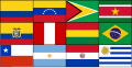 Start
Start


Article(s): Union of South American Nations, Dutch language
Request: SVG, it sould be extreemly simple, just add the SVGs of the flags together in the correct position and presto!-- SelfQ (talk) 14:47, 27 April 2008 (UTC)
Graphist opinion: I'm on it. Mangwanani (talk) 17:36, 27 April 2008 (UTC)
- Here's a start. Mangwanani (talk) 17:58, 27 April 2008 (UTC)
- The last ones are Image:Flag of Brazil.svg, Image:Flag of Venezuela.svg and Image:Flag of Argentina.svg. Don't forget to credit all of the sources for your images in the image description. Also the coat of arms in Ecuador's flag seems sqashed. Could try Image:Flag of Ecuador.svg instead. /Lokal_Profil 18:42, 27 April 2008 (UTC)
- That is the flag I used. Brazil and Argentina are corrupted. Don't know what happened with Venezula... Mangwanani (talk) 15:34, 28 April 2008 (UTC)
- Oh ye, its corrupted too. Mangwanani (talk) 15:37, 28 April 2008 (UTC)
- It's probably a naming problem. Brazil, Venezuela and Chile probably all have definitions/elements called "star" (or star1 etc). Both Argentina and Uruguay probably have definitions/elements called sun. That's my first guess anyhow. The problem with the Ecuadorian flag is that it is wider then the others. When it's squashed the CoA should remain unsquashed (but still centered). /Lokal_Profil 19:15, 28 April 2008 (UTC)
- Pass Mangwanani (talk) 19:55, 29 April 2008 (UTC)
- My suggestion is just stick with the civil variants as much as possible, just like it was done with Peru. User:Zscout370 (Return Fire) 02:51, 30 April 2008 (UTC)
- I think it would be best to stick as close to the original as posible, you would not add another star to the flag of the EU just because it would be easier to make. I would have thought this would be a snap, clearly I underestimated my knowledge of SVG's. My apologies. --SelfQ (talk) 21:37, 30 April 2008 (UTC)
- It still can be done, I just need to find time to hack at it. User:Zscout370 (Return Fire) 21:40, 30 April 2008 (UTC)
- If it hasn't been done by the time my exams are over I will give it a shot. My plan was to rename the definitions. I.e. open the brasil falg in a text editor and replacing every occurence of "star" by "br-star" and similar for the other clashes. But if anyone gets around to it before then thats great too =) /Lokal_Profil 09:31, 1 May 2008 (UTC)
- It still can be done, I just need to find time to hack at it. User:Zscout370 (Return Fire) 21:40, 30 April 2008 (UTC)
- I think it would be best to stick as close to the original as posible, you would not add another star to the flag of the EU just because it would be easier to make. I would have thought this would be a snap, clearly I underestimated my knowledge of SVG's. My apologies. --SelfQ (talk) 21:37, 30 April 2008 (UTC)
- My suggestion is just stick with the civil variants as much as possible, just like it was done with Peru. User:Zscout370 (Return Fire) 02:51, 30 April 2008 (UTC)
- Pass Mangwanani (talk) 19:55, 29 April 2008 (UTC)
- It's probably a naming problem. Brazil, Venezuela and Chile probably all have definitions/elements called "star" (or star1 etc). Both Argentina and Uruguay probably have definitions/elements called sun. That's my first guess anyhow. The problem with the Ecuadorian flag is that it is wider then the others. When it's squashed the CoA should remain unsquashed (but still centered). /Lokal_Profil 19:15, 28 April 2008 (UTC)
- Oh ye, its corrupted too. Mangwanani (talk) 15:37, 28 April 2008 (UTC)
- That is the flag I used. Brazil and Argentina are corrupted. Don't know what happened with Venezula... Mangwanani (talk) 15:34, 28 April 2008 (UTC)
- The last ones are Image:Flag of Brazil.svg, Image:Flag of Venezuela.svg and Image:Flag of Argentina.svg. Don't forget to credit all of the sources for your images in the image description. Also the coat of arms in Ecuador's flag seems sqashed. Could try Image:Flag of Ecuador.svg instead. /Lokal_Profil 18:42, 27 April 2008 (UTC)
- Here's a start. Mangwanani (talk) 17:58, 27 April 2008 (UTC)
- There we go, should be fixed now. /Lokal_Profil 03:12, 20 May 2008 (UTC)
- Resolved? Mangwanani (talk) 16:17, 21 May 2008 (UTC)
- Yes, its perfect, cheers. --SelfQ (talk) 16:32, 21 May 2008 (UTC)
- Resolved? Mangwanani (talk) 16:17, 21 May 2008 (UTC)
Jigme Khesar Namgyal Wangchuck

Article(s): Jigme Khesar Namgyal Wangchuck
Request: lighten for detail -- Chris (クリス • フィッチ) (talk) 05:38, 28 April 2008 (UTC)
Graphist opinion: Anything of an improvement? It seems way too garish, although it's much sharper now. Less adjustment was practically useless. Fvasconcellos (t·c) 19:38, 28 April 2008 (UTC)
- Perhaps the answer may be to cut the background away, like was done with the Steve Jobs photo several months ago? Chris (クリス • フィッチ) (talk) 21:08, 28 April 2008 (UTC)
- Its hard to determine where the background starts because of the black colour of the hair - Cradel 19:59, 29 April 2008 (UTC)
- If you look at it on an LCD monitor from an interesting angle you can see the border. Mangwanani (talk) 19:57, 2 May 2008 (UTC)
- Its hard to determine where the background starts because of the black colour of the hair - Cradel 19:59, 29 April 2008 (UTC)
Coat of arms of Gagauzia
-
 GIF
GIF -
PNG
-
 for color scheme
 -
 based on


Article(s): Coat of arms of Gagauzia
Request: SVGify, colors described at Coat of arms of Gagauzia -- Chris (クリス • フィッチ) (talk) 05:38, 28 April 2008 (UTC)
Graphist opinion:
In the mean time, I've removed the transparency from the GIF image and uploaded a transparent version in PNG format; that way at least it scales down better. By the way, looking at the color levels on the original GIF (and in particular the few "blacker-than-black" pixels around the banner), I have a suspicion that this may have originally been a color image that someone converted to grayscale. Anyone have any idea about the original colors? —Ilmari Karonen (talk) 19:53, 29 April 2008 (UTC)
- He said, "colors described at Coat of arms of Gagauzia." I could not find a colored version on Google as a model... James1293 (talk) 20:08, 29 April 2008 (UTC)
- I think he meant the articel on the Coat (Or the FotW page it references). 68.39.174.238 (talk) 14:26, 30 April 2008 (UTC)
- The article states "...white field, the yellow semi-circle of the rising sun. The shield is framed by golden spikes, themselves surrounded by a representation of the flag of Gagauzia. In the lower part, beyond the limits of the shield, is a conventional representation of grapevine leaves and grapes. The shield is surmounted by three five-pointed golden stars forming an equilateral triangle." I have added the flag for the color scheme. Chris (クリス • フィッチ) (talk) 14:57, 2 May 2008 (UTC)
Ceylon
Article(s): Coat of arms of Sri Lanka
Request: SVGify -- Chris (クリス • フィッチ) (talk) 21:28, 28 April 2008 (UTC)
Graphist opinion: Couldn't elements from Image:Coat_of_arms_of_Sri_Lanka.svg be used instead of tracing this entirely? Or does it need to look older/different from the current CoA...? I'll do a little work; if anyone else decides to work on this, please post. James1293 (talk) 20:00, 29 April 2008 (UTC)
- I can't speak for the original requester, but the lion could probably be taken from the current coat without much trouble. 68.39.174.238 (talk) 14:24, 30 April 2008 (UTC)
- I would be okay with that if someone wants to cannibalize other images. Chris (クリス • フィッチ) (talk) 01:13, 19 May 2008 (UTC)
Burma flag
.png)
Article(s): Burma
Request: SVGify -- Chris (クリス • フィッチ) (talk) 21:02, 29 April 2008 (UTC)
Graphist opinion: I had a go at it, I used the other Burma peacock, if it should be blue instead of green let me know. On a side note I hope something is up with the ImageMagic stuff, because all of the SVGs I see are really jagged. §hep • ¡Talk to me! 22:47, 29 April 2008 (UTC)
- I think it is supposed to be slightly bluer, but that is splendid thus far! It seems every new government changed the color. Chris (クリス • フィッチ) (talk) 05:04, 30 April 2008 (UTC)
- Sorry, the peackock or the flag itself? I set the background so it's pretty much the same, peacock need bluer as well? §hep • ¡Talk to me! 19:49, 30 April 2008 (UTC)
- Sould the blue from the Ensign not match the blue from the Union Jack like this: thumb|Blue Ensign
- --SelfQ (talk) 22:04, 30 April 2008 (UTC)
- That's what I had originally. I don't have a clue. If it is it's easy to revert. §hep • ¡Talk to me! 23:31, 30 April 2008 (UTC)
- Sorry, the peackock or the flag itself? I set the background so it's pretty much the same, peacock need bluer as well? §hep • ¡Talk to me! 19:49, 30 April 2008 (UTC)
- The peacock should be blue instead of green, is what I meant, sorry for being unclear. Chris (クリス • フィッチ) (talk) 01:32, 1 May 2008 (UTC)
- IMO the coloring didn't come out great. I left the original underneath the blue one if anyone else wants to crack at it. §hep • ¡Talk to me! 20:15, 1 May 2008 (UTC)
Norman Rockwell

Article(s): Norman Rockwell
Request: remove some glue staining around face -- Chris (クリス • フィッチ) (talk) 01:55, 1 May 2008 (UTC)
Graphist opinion:
Sudan political regions
-

-
 SVG basis
 -
how about something like this for color scheme? The colors seem to go well together
-
 Start
Start -
 New basis


Article(s): Southern Sudan
Request: using less weird colors -- Chris (クリス • フィッチ) (talk) 01:55, 1 May 2008 (UTC)
Graphist opinion:
- Found an SVG basis for a new map. /Lokal_Profil 09:44, 1 May 2008 (UTC)
- This looks like a somewhat wonky trace (no offense to the author); perhaps The Map Library has a more accurate file? As for the color scheme, any preference? Fvasconcellos (t·c) 18:11, 1 May 2008 (UTC)
- There are som nice maps there but my .shp to .svg converter couldn't deal with them =( /Lokal_Profil 20:15, 1 May 2008 (UTC)
- This looks like a somewhat wonky trace (no offense to the author); perhaps The Map Library has a more accurate file? As for the color scheme, any preference? Fvasconcellos (t·c) 18:11, 1 May 2008 (UTC)
- How about something like this for color scheme? The colors seem to go well together, and are generally neutral. Chris (クリス • フィッチ) (talk) 01:02, 2 May 2008 (UTC)
- Here's a start with the colour scheme suggested by Chris. Mangwanani (talk) 19:55, 2 May 2008 (UTC)
- Very good, thank you! The stripe about 2/3 of the way down seems intentional, explained in the article itself as "Boundary of Abyei at 10°22'30"N as decided by the Abyei Boundary Commission". Chris (クリス • フィッチ) (talk) 04:37, 3 May 2008 (UTC)
- Will see to it... Mangwanani (talk) 16:24, 5 May 2008 (UTC)
- A map of the administrative divisions of Sudan. Jackaranga (talk) 12:19, 6 May 2008 (UTC)
- Not very detailed though. Jackaranga (talk) 12:22, 6 May 2008 (UTC)
- Its different to the current ones and the blank version in the gallery is more alike to the raster than the aforementioned link. Mangwanani (talk) 18:39, 6 May 2008 (UTC)
- The actuall subdivisions don't seem to agree. What's the source for the image? /Lokal_Profil 17:11, 8 May 2008 (UTC)
- No idea. Ask Jackaranga or the requestor... Mangwanani (talk) 18:48, 8 May 2008 (UTC)
- managed to convert the shape file to svg. This should hopefully provide us with a better template for future maps. I'll link to it here once it's uploaded. /Lokal_Profil 15:14, 9 May 2008 (UTC)
- Uploaded a new basis which can be used for future maps. /Lokal_Profil 16:35, 11 May 2008 (UTC)
- managed to convert the shape file to svg. This should hopefully provide us with a better template for future maps. I'll link to it here once it's uploaded. /Lokal_Profil 15:14, 9 May 2008 (UTC)
- No idea. Ask Jackaranga or the requestor... Mangwanani (talk) 18:48, 8 May 2008 (UTC)
- The actuall subdivisions don't seem to agree. What's the source for the image? /Lokal_Profil 17:11, 8 May 2008 (UTC)
- Its different to the current ones and the blank version in the gallery is more alike to the raster than the aforementioned link. Mangwanani (talk) 18:39, 6 May 2008 (UTC)
- Not very detailed though. Jackaranga (talk) 12:22, 6 May 2008 (UTC)
New World Regions
-
 Final version?
 -
WAGGGS map
-
WOSM map

Article(s): WAGGGS-Western Hemisphere Region, image used on several language iterations: it:AMGE-Regione dell'Emisfero Occidentale, vi:Vùng Nữ Hướng đạo Tây Bán Cầu (WAGGGS)
Article(s): WOSM-Interamerican Region, image used on several language iterations: it:OMMS-Region Interamericana), sv:Amerikanska scoutregionen (WOSM), vi:Vùng Hướng đạo Liên Mỹ (WOSM), zh:世界童軍運動組織美洲區
Request: SVGify using Image:BlankMap-World-162E-flat.svg as a base map, include in gold Hawaii, Guam, American Samoa, the Northern Marianas, the Marshall Islands, Micronesia and Palau; only leave Greenland, Cuba and French Guiana grey in region, all other Pacific islands gold -- Chris (クリス • フィッチ) (talk) 01:55, 1 May 2008 (UTC)
Graphist opinion:
- Uploaded a first cut for the map, please tell me if you want the left hand border further to the right or to the left. /Lokal_Profil 09:56, 1 May 2008 (UTC)
- If you could trim Iceland off the right side, and then trim that same depth off the left side, that would be a good trim. Thank you for your help! Chris (クリス • フィッチ) (talk) 16:32, 1 May 2008 (UTC)
- Iceland is gone, also trimmed a tad of the left side but wasn't sure how much was needed. /Lokal_Profil 20:26, 1 May 2008 (UTC)
- If you could trim Iceland off the right side, and then trim that same depth off the left side, that would be a good trim. Thank you for your help! Chris (クリス • フィッチ) (talk) 16:32, 1 May 2008 (UTC)
- That's great for perspective right there, please remove the blank space all the way around so the thumbnail will shoe up larger, thank you! Chris (クリス • フィッチ) (talk) 23:38, 1 May 2008 (UTC)
- Done, converting country list to list of iso codes will have to wait until next week though. /Lokal_Profil 00:30, 2 May 2008 (UTC)
- That's all right, take your time, thank you so much, you do such nice work!
- Also, would you put a squared-off white background under eastern Greenland, so it is not an odd-shaped graphic? Thank you! Chris (クリス • フィッチ) (talk) 00:40, 2 May 2008 (UTC)
- Wouldn't it be better to move the right hand side edge in a bit even though that means cutting Greenland in half? Then Africa wouldn't be "unrealistically hidden" and since Australia is already cut and since Greenland isn't highlighted anyway... /Lokal_Profil 16:48, 2 May 2008 (UTC)
- No, because Greenland is geographically part of North America, the topic of the map, and Africa is not. Chris (クリス • フィッチ) (talk) 04:34, 3 May 2008 (UTC)
- OK, basically ready to upload, jsut wondering if you really wantone map or if you preferr one for WOSM-Interamerican Region and a separate one for WAGGGS-Western Hemisphere Region since they don't include the same countries. Also is there a suitable colour for Associate members that you would like? /Lokal_Profil 15:08, 11 May 2008 (UTC)
- Humm, after entering the countries in the WOSM-Interamerican Region and WAGGGS-Western Hemisphere Region I'm wondering which countries should be highlighted in addition (and why). Specifically my map includes nothing to the west of Hawaii. /Lokal_Profil 15:35, 11 May 2008 (UTC)
- Ok uploaded two separate maps. Any feedback is more then welcome. /Lokal_Profil 23:42, 16 May 2008 (UTC)
- Humm, after entering the countries in the WOSM-Interamerican Region and WAGGGS-Western Hemisphere Region I'm wondering which countries should be highlighted in addition (and why). Specifically my map includes nothing to the west of Hawaii. /Lokal_Profil 15:35, 11 May 2008 (UTC)
- OK, basically ready to upload, jsut wondering if you really wantone map or if you preferr one for WOSM-Interamerican Region and a separate one for WAGGGS-Western Hemisphere Region since they don't include the same countries. Also is there a suitable colour for Associate members that you would like? /Lokal_Profil 15:08, 11 May 2008 (UTC)
The reason those other island groupings are included is that they are part of the Aloha Council of the Boy Scouts of America. Please see Scouting in Hawaii, and it will give you the rationale for those islands being included. Sometimes it is okay to trust that other editors know what they are asking for. ;) Thanks, Chris (クリス • フィッチ) (talk) 04:16, 18 May 2008 (UTC)
- The problem is that since I'm colouring in by iso code rather then by tryinng to figure out which country is which on the old map I was limited by the information I had. Now that I have a breakdown of the last islands I'll add them =) /Lokal_Profil 15:47, 18 May 2008 (UTC)
- OK, the countries under Aloha Council have been added to the WOSM map. Is there a similar situation for WAGGS? Please also tell me if you see any other places missing ora anything else. /Lokal_Profil 16:00, 18 May 2008 (UTC)
- Just realised that I'd missed the USA insular areas which I'm guessing fall under Boy/Girl scouts of USA. So I'll add as, gu, mp, pr and vi to both maps. With respect to my previous question it's now reduced to whether the Marshall islands, Micronesia and Palau should be part of the WAGGS map. /Lokal_Profil 16:11, 18 May 2008 (UTC)
- Also the ocean is no square as requested. /Lokal_Profil 16:22, 18 May 2008 (UTC)
- Just realised that I'd missed the USA insular areas which I'm guessing fall under Boy/Girl scouts of USA. So I'll add as, gu, mp, pr and vi to both maps. With respect to my previous question it's now reduced to whether the Marshall islands, Micronesia and Palau should be part of the WAGGS map. /Lokal_Profil 16:11, 18 May 2008 (UTC)
- OK, the countries under Aloha Council have been added to the WOSM map. Is there a similar situation for WAGGS? Please also tell me if you see any other places missing ora anything else. /Lokal_Profil 16:00, 18 May 2008 (UTC)
- I apologize for not being clear, the original image was a single map, bot the Boy Scout and Girl Scout regions occupy the same territory. There is no need for two separate maps. Chris (クリス • フィッチ) (talk) 01:21, 19 May 2008 (UTC)
- Please use the WOSM map for the base, and overwrite it onto Image:WAGGGS-WOSMWestHemMap-World.svg so the name is correct-it should be "Image:WAGGGS-WOSMWestHemMap-World.svg". Please include Hawaii as part of the United States. Thank you so much! Chris (クリス • フィッチ) (talk) 01:24, 19 May 2008 (UTC)
- No problems. Do you want associate and full members in the same colour? Hawaii is included it's just that Hawaii doesn't have a circle since it's part of "mainland" US. /Lokal_Profil 03:23, 19 May 2008 (UTC)
Flag of Anna-Paulowna
-
 Flag of Anna-Paulowna

Article(s): Anna Paulowna
Request: SVG please. -- SelfQ (talk) 21:58, 1 May 2008 (UTC)
Graphist opinion:
scale poorly, SVGify
Article(s): several
Request: all scale poorly, SVGify -- Chris (クリス • フィッチ) (talk) 00:24, 2 May 2008 (UTC)
Graphist opinion:
Scout Association of Japan
Article(s): Scout Association of Japan
Request: put on regular Wiki-style white or clear background, lighten for detail -- Chris (クリス • フィッチ) (talk) 00:24, 2 May 2008 (UTC)
Graphist opinion: I think a whole new image would be the best option. Mangwanani (talk) 16:08, 2 May 2008 (UTC)
- Agreed, but failing that... Chris (クリス • フィッチ) (talk) 04:30, 3 May 2008 (UTC)
- Please someone try anyway. Chris (クリス • フィッチ) (talk) 01:25, 19 May 2008 (UTC)
Pikachu

Article(s): Pikachu
Request: This SVG image is derived from a CDR file, which can be found here. Because I thought it would look good in the article, I reverted it to SVG. I also reduced the size of it, which seem to have caused quiet an aliasing problem. As you can see in the file history, Tkgd2007 already tried to fix it, but unfortunately it didn't work, so I reverted. Is there anyone who can fix this aliasing? Preferably, the picture should look exactly like the CDR image. -- Face 21:23, 4 May 2008 (UTC)
Graphist opinion:
Just for the record, Tkgd2007 has commented on this issue here. - Face 21:54, 4 May 2008 (UTC)
- This happens when high-resolution (or SVG) images get scaled down, perhaps it could be fixed with a lower resolution PNG -- CD 10:16, 7 May 2008 (UTC)
Brades, Monserrat
-
 Description of image
 -
Without Davy Hill
-
With Davy Hill

Article(s): Brades, Montserrat, Geography of Montserrat
Request: Our article on Montserrat does not have a map which shows the ___location of the de facto capital, the map in the Brades article is low quality, the map on Geography of Montserrat also does not have that village shown. The Google Earth seems to show that it would be between Gerald's and Davy Hill on this map. -- Rmhermen (talk) 18:39, 5 May 2008 (UTC)
Graphist opinion: Does any of these work ? , in the first one I removed Davy Hill because having both cities/towns didn't look that well, but I uploaded both so you decide which is better (the ___location of Brades was taken from the article ) -- CD 12:00, 7 May 2008 (UTC)
- Thanks. I've used the first map in the Montserrrat article. Rmhermen (talk) 01:36, 12 May 2008 (UTC)
Interpol
-
The Interpol logo.
Article(s): Interpol, William Higgitt
Request: SVG and put on a clear background --SelfQ (talk) 11:56, 6 May 2008 (UTC)
Graphist opinion:
- Not sure it's worth turning this into ans SVG since it is a copyrighted logo and the same would go for the derivative SVG. /Lokal_Profil 17:09, 8 May 2008 (UTC)
- Yup as long as you find it in vector format already and don't make a vector version yourself based on the raster version it is fine to have SVG. You can look for vector versions in PDF documents for example. Jackaranga (talk) 20:14, 8 May 2008 (UTC)
Ares I-X patch
-
 Patch of Ares I-X

Article(s): Ares I-X
Request: Improve this NASA patch by making the colors more solid, remove Collectspace logo and convert to the right image format. Hektor (talk) 23:24, 9 May 2008 (UTC)
Graphist opinion:
- Comment Can't a better version be found at the NASA website? On another note, Mysid (talk · contribs) is our resident mission patch maven—she's done dozens of these in SVG, maybe she can work her magic on this one :) Fvasconcellos (t·c) 13:04, 10 May 2008 (UTC)
- Answer Unfortunately I haven't found it anywhere so far except in two places : hanging on a wall in a Lockheed building I was visiting in Denver last February, and on this Collectspace web site where it was taken from. However, maybe that in a few months, when the actual flight is going to draw closer, NASA is hoing to make this patch broadly available ? Hektor (talk) 13:50, 10 May 2008 (UTC)
Dental explorer
-
 Dental explorer
 -
 A different picture with brighter lighting
 -
 Removing light reflexion and shadow
 -
 Removing background entirely


Article(s): For use in Dental caries or Dental explorer
Request: Can the background be whitened or cleaned up? Thank you! - Dozenist talk 15:49, 11 May 2008 (UTC)
Graphist opinion:
- Since you are the photographer I would recommend retaking the photo with better lighting (preferable many light sources to reduce shadows). If you can't retake the photograph for some reason then please give a shout and someone might be able to whiten the current version. /Lokal_Profil 16:13, 11 May 2008 (UTC)
- I took a new photo of a different explorer, but this time outside with the sun. Would this work better? - Dozenist talk 16:34, 11 May 2008 (UTC)
- I still like the first one better though, perhaps if we removed the shadow and the light reflexion at the top, like this, it would look better -- CD 22:20, 11 May 2008 (UTC)
- Thanks for the work! I think that makes the picture look a whole lot better. Would there be any difficulty or any resulting problem in lightening the photo a little? - Dozenist talk 22:58, 11 May 2008 (UTC)
- What about just removing the background entirely? See above... -- TIM KLOSKE|TALK 22:12, 19 May 2008 (UTC)
- Wow. I just noticed your post and I think the photo looks great. Thank you very much! - Dozenist talk 13:07, 20 May 2008 (UTC)
- What about just removing the background entirely? See above... -- TIM KLOSKE|TALK 22:12, 19 May 2008 (UTC)
- Thanks for the work! I think that makes the picture look a whole lot better. Would there be any difficulty or any resulting problem in lightening the photo a little? - Dozenist talk 22:58, 11 May 2008 (UTC)
- I still like the first one better though, perhaps if we removed the shadow and the light reflexion at the top, like this, it would look better -- CD 22:20, 11 May 2008 (UTC)
- I took a new photo of a different explorer, but this time outside with the sun. Would this work better? - Dozenist talk 16:34, 11 May 2008 (UTC)
SVG of Wildscale
-
 To be vectored
 -
 Vectored


Article(s): Windscale fire
Request: SVG in place. 68.39.174.238 (talk) 21:24, 11 May 2008 (UTC)
Opinion: This is pretty good for raster, but I'll work on something over the next few days. This is fairly easy compared to the computers, above.--HereToHelp (talk to me) 00:37, 12 May 2008 (UTC)
- How's this?--HereToHelp (talk to me) 20:49, 12 May 2008 (UTC)
- Sorry for the time difference. Is there a reason for the change in sizes of the fuel rods? The older one looks better to me (Those would be huge fuel rods compared to the size of the chimney!). 68.39.174.238 (talk) 21:37, 17 May 2008 (UTC)
- (The rods are too big...I'll let that drop...) How about now?--HereToHelp (talk to me) 15:56, 18 May 2008 (UTC)
- OK; Just one extra thing: Can you use something similar to the original drawing for the replacement of the fuel rods? The current design makes it look like there was a regular stream entering and leaving, while the original makes it look more like "push one in, and one falls out", which is I think how the system actually operated (?). 68.39.174.238 (talk) 16:50, 18 May 2008 (UTC)
- Better now?--HereToHelp (talk to me) 01:31, 19 May 2008 (UTC)
- OK; Just one extra thing: Can you use something similar to the original drawing for the replacement of the fuel rods? The current design makes it look like there was a regular stream entering and leaving, while the original makes it look more like "push one in, and one falls out", which is I think how the system actually operated (?). 68.39.174.238 (talk) 16:50, 18 May 2008 (UTC)
- (The rods are too big...I'll let that drop...) How about now?--HereToHelp (talk to me) 15:56, 18 May 2008 (UTC)
- Sorry for the time difference. Is there a reason for the change in sizes of the fuel rods? The older one looks better to me (Those would be huge fuel rods compared to the size of the chimney!). 68.39.174.238 (talk) 21:37, 17 May 2008 (UTC)
- Perfect! 68.39.174.238 (talk) 17:32, 19 May 2008 (UTC)
Merging data from two images
-
 Put information onto this one
 -
 Take info from here


Article(s): Electromagnetic spectrum
Request: The electromagnetic spectrum article is cluttered with so many EM pictures which just restates what was in the previous picture. Can someone please merge the information from these 2 images together? Thank you so very much!-- penubag (talk) 01:01, 13 May 2008 (UTC)
Graphist opinion: What, specifically, do you want merged?--HereToHelp (talk to me) 01:26, 13 May 2008 (UTC)
- Everything that's in image2 that's not in image1, which isn't much: (wavelength, electromagnetic radiation names (gamma, x-ray, etc), and the text in gray (if possible). Again, thanks a lot! -- penubag (talk) 02:58, 13 May 2008 (UTC)
- X-rays and gamma rays are in image 1, as are the wavelengths (just stated in meters and scientific notation rather than a bunch of different meter-based units. The gray text ("Near IR", "Thermal IR", "AM") is minor and I might be able to add that in, but it might disrupt the flow so much that it wouldn't be worth it. The 50 to 1000 MHz blowup is so detailed that it might be worth creating a separate image of only that.--HereToHelp (talk to me) 21:11, 13 May 2008 (UTC)
- Agree with HereToHelp. Apart from the radio/TV frequencies everything is already in EM Spectrum Properties edit.svg. For the radio wave bit a new image involving all of the frequencies in Radio frequency would be nice. Possibly with a small image/icon for each band. /23:30, 13 May 2008 (UTC)
- X-rays and gamma rays are in image 1, as are the wavelengths (just stated in meters and scientific notation rather than a bunch of different meter-based units. The gray text ("Near IR", "Thermal IR", "AM") is minor and I might be able to add that in, but it might disrupt the flow so much that it wouldn't be worth it. The 50 to 1000 MHz blowup is so detailed that it might be worth creating a separate image of only that.--HereToHelp (talk to me) 21:11, 13 May 2008 (UTC)
Indian personalities

Article(s): 2008 attacks on North Indians in Maharashtra
Request:
- First photo needs some more light I guess.
- Second one too is not very clear.
- Third one has dark fringes in the corners.
BTW I have no technical knowledge about photography hence may have used incorrect terms above. So feel free to do anything to make these images better. Thanks KnowledgeHegemonyPart2 (talk) 06:27, 13 May 2008 (UTC)
- Please use the guidelines set at the top of the page when you want to post a request. It makes things easier for us and the bot that archives this page. First image I can do. I don't understand what you want on the third image? XcepticZP (talk) 13:36, 13 May 2008 (UTC)
- I am very sorry about not following the guidelines. I striked off the third image.KnowledgeHegemonyPart2 (talk) 19:42, 13 May 2008 (UTC)
- Thanks a ton for improving the image - Image:Laluprasadyadav.jpg. Can Image:Amitabh Bachchan.jpg be improved too? KnowledgeHegemonyPart2 (talk) 14:52, 14 May 2008 (UTC)
- No it can't. His hair is black like the background, so I can't separate the two. Sorry. XcepticZP (talk) 21:45, 16 May 2008 (UTC)
- Thanks a ton for improving the image - Image:Laluprasadyadav.jpg. Can Image:Amitabh Bachchan.jpg be improved too? KnowledgeHegemonyPart2 (talk) 14:52, 14 May 2008 (UTC)
- I am very sorry about not following the guidelines. I striked off the third image.KnowledgeHegemonyPart2 (talk) 19:42, 13 May 2008 (UTC)
Graphist opinion:
Delage
-
Logo of Delage
Article(s): Delage
Request: This is a much less geometric one. Could we have a .svg logo for the defunct French brand Delage ? The Delage logo shown is black and white, but indeed the real logo was nice navy/dark blue, as shown on the web page of the Delage owner's club. Hektor (talk) 23:24, 9 May 2008 (UTC)
Graphist opinion:
- Direct link to the image [2]. /Lokal_Profil 22:49, 16 May 2008 (UTC)
- Can't do SVGs for logos I believe Mangwanani (talk) 17:55, 18 May 2008 (UTC)
- Can someone confirm this ? 193.56.37.1 (talk) 07:25, 19 May 2008 (UTC)
- I don't know where the boundaries lie as there are some uses where SVG logos are allowed but others where they aren't. It would be best for someone to clarify this... Mangwanani (talk) 18:19, 19 May 2008 (UTC)
- I don't understand. I recently asked for a Lloyd logo and nobody said anything of the kind. Hektor (talk) 19:02, 19 May 2008 (UTC)
- This is what I mean by a hazy area. I have requested other logos to be SVGd to be told that it couldn't be done for copyright reasons so I don't know where the boundaries lie... Mangwanani (talk) 19:23, 19 May 2008 (UTC)
- I don't understand. I recently asked for a Lloyd logo and nobody said anything of the kind. Hektor (talk) 19:02, 19 May 2008 (UTC)
- I don't know where the boundaries lie as there are some uses where SVG logos are allowed but others where they aren't. It would be best for someone to clarify this... Mangwanani (talk) 18:19, 19 May 2008 (UTC)
- Can someone confirm this ? 193.56.37.1 (talk) 07:25, 19 May 2008 (UTC)
- Can't do SVGs for logos I believe Mangwanani (talk) 17:55, 18 May 2008 (UTC)
Graphic designer needed
I'm looking for a skilled graphic designer.
I need an image for a non-barnstar Wikipedia award with the theme "World Traveler".
I was thinking perhaps the following image, without the barnstar, and with the globe (or another one) superimposed over the Wikipedia globe (or the Wikipedia globe superimposed over it) - I'd like to see the world's countries and the puzzle pieces (with the continents more prominent).
The image also needs a passport laying on the surface beneath the globe stand (where its shadow is, but the shadow should be retained as well). The image's background must be transparent (not white like the background of the image below).
File:Interlingual Barnstar.png
Is this something you can do?
If so, please contact me on my talk page.
I look forward to your reply.
The Transhumanist 03:38, 17 May 2008 (UTC)
-
 How does this one look?

Good start. Can you change the globe to one where you can discern the continents? Then place it in the brass stand in the image above, then place the passport on the surface beneath the stand? The Transhumanist 07:29, 17 May 2008 (UTC)
- Would it help if I created a stylized svg passport?--HereToHelp (talk to me) 19:02, 17 May 2008 (UTC)
EADS Space Tourism
-
 Flight profile

Article(s): EADS Astrium Space Tourism Project
Request: Create a .SVG version of the following mission curve. Hektor (talk) 23:24, 14 May 2008 (UTC)
Graphist opinion:
- It would be easier to do with the original data. /Lokal_Profil 22:44, 17 May 2008 (UTC)
- Unfortunately I picked the information in a French newspaper Le Figaro last year, I have thrown it away a long time ago. You can find a similar curve on this .pdf document however. Hektor (talk) 07:04, 18 May 2008 (UTC)
Intifada deaths
Article: Second Intifada
Request: I used an online program to create this SVG chart: Image:Intifada deaths.svg
It is currently in this article and section:
There I used this wikicode:
- [[Image:Intifada deaths.svg|thumb|400px]]
In the caption it says "click image to enlarge."
So people do so, and arrive at the image description page where the image is at this size:

Can someone adjust the size of the image so that it is around 600 pixels wide on the commons page, commons:Image:Intifada deaths.svg, so that it is easily legible there? I don't know anything about SVG image editing.
- [[Image:Intifada deaths.svg|none|600px]]
Also, what freeware SVG image editor is the easiest to use? I am interested in simplicity more than I am interested in options.
I see these pages:
- Comparison of vector graphics editors
- List of vector graphics editors --Timeshifter (talk) 02:54, 18 May 2008 (UTC)
- I recommend Inkscape. It's fairly easy to learn and hey, it's free.--HereToHelp (talk to me) 03:18, 18 May 2008 (UTC)
- Thanks. Any others you would recommend also? Is Inkscape easy-to-use for creating charts and graphs? That is my current interest. --Timeshifter (talk) 06:44, 18 May 2008 (UTC)
- Yes. Go to File->Document properties->Grids tab, which helps you keep everything nice and even. The text editing can be a little buggy at times, but it's useable, and there's good color editing and alignment tools, located in the main icon bar towards the right.--HereToHelp (talk to me) 11:44, 18 May 2008 (UTC)
- Thanks again! I hope to check it out soon. --Timeshifter (talk) 22:26, 18 May 2008 (UTC)
- Yes. Go to File->Document properties->Grids tab, which helps you keep everything nice and even. The text editing can be a little buggy at times, but it's useable, and there's good color editing and alignment tools, located in the main icon bar towards the right.--HereToHelp (talk to me) 11:44, 18 May 2008 (UTC)
- Thanks. Any others you would recommend also? Is Inkscape easy-to-use for creating charts and graphs? That is my current interest. --Timeshifter (talk) 06:44, 18 May 2008 (UTC)
- I recommend Inkscape. It's fairly easy to learn and hey, it's free.--HereToHelp (talk to me) 03:18, 18 May 2008 (UTC)
(unindent) I did not know this. I have been using the Firefox browser a long time, and it sees a larger version of the chart when the chart is clicked on the image description page. But in Internet Explorer, one gets a message asking whether to open or save the SVG file. If one does not have an SVG viewer (like the freeware image editor IrfanView) installed, then one will not see the larger version of the chart. So this makes changing the default size of this chart more important. The SVG chart needs to be larger, or I will have to put back the GIF version of the chart in the article, Second Intifada, so that when people click the chart in the article they see a more legible version. The Gif version is not as legible though at the 400-pixel-wide size of the image found in the article. Compare here:
- [[Image:Intifada deaths.svg|thumb|none|400px]]

- [[Image:Intifada deaths.gif|thumb|none|400px]]
Click the GIF image to see that it enlarges in any browser. --Timeshifter (talk) 07:17, 18 May 2008 (UTC)
IMHO this diagram needs some additional work:
- legend for brown color code missing
- legend for violet color code missing
- death number besides blue bullet to be removed
--Túrelio (talk) 07:30, 18 May 2008 (UTC)
- I agree. I used a primitive online editing program to create the chart. It is very quirky and did not allow me to do what I wanted. The chart could use a lot of work. I encourage others to create additional charts using better tools. Please upload those charts separately with different names. I want to keep working on this chart myself. I could use help though in getting it to a larger default size. --Timeshifter (talk) 07:36, 18 May 2008 (UTC)
- Additionally the weblink in the bottom should be removed. If that is the source for the info then that should be mantioned on the image page but not in the image itself. Anyhow I'll give it a try to have 600px as the standard viewing size (IE and FF). /Lokal_Profil 15:17, 18 May 2008 (UTC)
- OK Image:Intifada deaths2.svg should do it. Also removed the url and the number 44 from the blue bullet point. Text is still needed for the last bullet points though. /Lokal_Profil 15:29, 18 May 2008 (UTC)
- Thanks! The chart is used outside Wikipedia, too. So the URL is needed. I will need to learn an SVG program. There are so many things wrong with my original chart due to the quirkiness of the online editing program I used. I have a request. Could you put "Killed by Israeli civilians" at the bottom right of the chart in the same format as the other column labels? I was unable to do it myself because the online program messed up other stuff when I tried that. Then you can remove the label text altogether from the blue label on the right side. Then I will upload your version of the chart (with or without the URL) in place of my original version. --Timeshifter (talk) 22:24, 18 May 2008 (UTC)
- Added the lable at the bottom of the blue bar but left the legend since all the other colours had them. Although I can see a need for the url when the chart is used outside wikipedia I'd leave it of the one used here, since we have specific image pages all that's needed is to put that info there instead. The only thing that's missing is some sort of legend for the brown and violet colours. Couldn't come up with a good formulation myself but if you have any suggestions I'll be happy to add them. /Lokal_Profil 03:07, 19 May 2008 (UTC)
- Thanks again. How about "Israeli breakdown" and "Palestinian breakdown"? Also, do you happen to know what font the Wikipedia CSS style sheets are using for the SVG text in the chart? It looks good. It might be good to add that font name directly into the SVG code so that the SVG chart looks good outside Wikipedia, too. The SVG chart has a thin ugly font outside Wikipedia when I download the current SVG file and look at in my image editor, IrfanView.
- Thought of something else. It might be good to label the totals too on the side: "Israeli total" and "Palestinian total." --Timeshifter (talk) 07:21, 19 May 2008 (UTC)
- Added the last labels. The whole font issue is tricky since mediawiki has a notoriously bad track record when it comes to fonts. Removing the comic sans tag is however never wrong since it is a silly font to start with =). Anyhow hope the final version is ok. /Lokal_Profil 14:13, 19 May 2008 (UTC)
- It seems that I am having the same problem as before with the online chart creator. One thing gets fixed but then another problem shows up. When I removed the font name from the SVG code text I see that a serif font was then used by MediaWiki. A sans-serif font was being used by MediaWiki before. The serif font makes the chart almost unreadable at the size it is used in the wikipedia article (400 pixels wide).
- Added the last labels. The whole font issue is tricky since mediawiki has a notoriously bad track record when it comes to fonts. Removing the comic sans tag is however never wrong since it is a silly font to start with =). Anyhow hope the final version is ok. /Lokal_Profil 14:13, 19 May 2008 (UTC)
- Added the lable at the bottom of the blue bar but left the legend since all the other colours had them. Although I can see a need for the url when the chart is used outside wikipedia I'd leave it of the one used here, since we have specific image pages all that's needed is to put that info there instead. The only thing that's missing is some sort of legend for the brown and violet colours. Couldn't come up with a good formulation myself but if you have any suggestions I'll be happy to add them. /Lokal_Profil 03:07, 19 May 2008 (UTC)
- Thanks! The chart is used outside Wikipedia, too. So the URL is needed. I will need to learn an SVG program. There are so many things wrong with my original chart due to the quirkiness of the online editing program I used. I have a request. Could you put "Killed by Israeli civilians" at the bottom right of the chart in the same format as the other column labels? I was unable to do it myself because the online program messed up other stuff when I tried that. Then you can remove the label text altogether from the blue label on the right side. Then I will upload your version of the chart (with or without the URL) in place of my original version. --Timeshifter (talk) 22:24, 18 May 2008 (UTC)
- OK Image:Intifada deaths2.svg should do it. Also removed the url and the number 44 from the blue bullet point. Text is still needed for the last bullet points though. /Lokal_Profil 15:29, 18 May 2008 (UTC)
(unindent) I uploaded a clearer version of the chart. A different sans-serif font is used this time (not comic sans). It has one less column, and no longer has a legend (now unnecessary). I also removed "Deaths" on the left side. I returned the source URL. It is important and takes little space. I will keep experimenting (see farther down) and uploading new versions. Feel free to do the same. I like this temp page for experimentation. It is the only way to see what MediaWiki will do with the SVG file. I still need to figure out how to make the default size of the chart larger on the commons image description page.--Timeshifter (talk) 06:53, 20 May 2008 (UTC)
I downloaded and installed Inkscape and tried to figure out how to make charts a little bit. It looks way too difficult at first glance. So I looked at Google spreadsheets, and this is how far I have gotten:
It can export the chart in PDF, HTML, CSV, Excel, .ods (OpenDocument Spreadsheet format used by Open Office), and text. I think I might try Open Office next. I believe it edits charts and can save them in SVG. --Timeshifter (talk) 06:53, 20 May 2008 (UTC)
- Timeshifter, Do NOT delete people's posts. My deleted post was as follows(so all the people can see what you're trying to cover up):
- Why are you incapable of using the set request format presented at the top of this page? The graphic lab is doing you a favor, so you should give us the courtesy and not mess up our system. This is happening way too often. These out of format requests need to be removed and not considered. XcepticZP (talk) 19:45, 18 May 2008 (UTC)
- XcepticZP (talk) 10:26, 20 May 2008 (UTC)
- I had responded to you concerning all of this on the talk page: Wikipedia_talk:Graphic Lab/Images to improve#Format Anomalies, and I had implemented your request. So I removed your now-offtopic comment, since it was a duplication of the talk page, and I did not want to have to duplicate my reply here. So it was not a cover-up. Please WP:AGF, and please reread WP:CIVIL. And please do not continue this offtopic discussion here. --Timeshifter (talk) 12:01, 20 May 2008 (UTC)
(unindent) The first SVG image, Image:Intifada deaths.svg, is not currently showing up. I put in a request for help at:
- commons:Commons:Administrators' noticeboard/Attention#Image:Intifada deaths.svg --Timeshifter (talk) 12:48, 20 May 2008 (UTC)
- The only problem with your update is that it once again made the image to small to read for IE users. I thought that was the main problem we tried to fix. Regarding the URL. I repeat that it should be in the image page and not in the actual image, if you want to use the image with the url outside wikipedia then you can add it to that version. Also lastly I think that the image was probably clearer when there were legends but that's a minor problem which can be fixed in the image caption. /Lokal_Profil 14:40, 20 May 2008 (UTC)
- Fixed image size and URL, also cleaned up the code and uploaded to Image:Intifada deaths.svg. /Lokal_Profil 15:13, 20 May 2008 (UTC)
- The only problem with your update is that it once again made the image to small to read for IE users. I thought that was the main problem we tried to fix. Regarding the URL. I repeat that it should be in the image page and not in the actual image, if you want to use the image with the url outside wikipedia then you can add it to that version. Also lastly I think that the image was probably clearer when there were legends but that's a minor problem which can be fixed in the image caption. /Lokal_Profil 14:40, 20 May 2008 (UTC)
- Thanks! We might agree to disagree on the URL. Sources are commonly added to charts and graphs. I think the chart and the chart text is clearer at 400 pixels wide when the legend is removed. Can you tell me what to do in Inkscape to increase the default size of an SVG chart? I have been experimenting with another program, OpenOffice.org Calc, to try to create this chart better. I am having some luck with it. But it will take more time. --Timeshifter (talk) 15:19, 20 May 2008 (UTC)
- Actually, it does look nicer without the legends. I've added the legend info to he image page instead, that way it can be put into the image description if desired. Hte default size problem is due to the "viewbox" parameter that had been added to the image. However if you just remove the viewbox parameter then you suddenly see all of the white space surrounding the image. The way I solved it was to reove the viewbox parameter then copy paste the whole image into a new image where the "page size" was the same as the image size. Then save it as "plain svg". This also had the added benefit of removing random junk code in the original version. If you find a good program for making charts in svg then please give me a shout since apart from doing it by hand in Inkscape (tedious) I haven't found any and there are a lot of charts/diagrams in commons:Category:Images that should use vector graphics with subcategories. /Lokal_Profil 15:45, 20 May 2008 (UTC)
- Thanks! We might agree to disagree on the URL. Sources are commonly added to charts and graphs. I think the chart and the chart text is clearer at 400 pixels wide when the legend is removed. Can you tell me what to do in Inkscape to increase the default size of an SVG chart? I have been experimenting with another program, OpenOffice.org Calc, to try to create this chart better. I am having some luck with it. But it will take more time. --Timeshifter (talk) 15:19, 20 May 2008 (UTC)
- Thanks for the Inkscape how-to. OpenOffice.org Calc and OpenOffice.org Draw seem to be working for me so far. I have a chart built with them based on a spreadsheet using the stats in the chart here. It needs more work. OpenOffice.org can save in many formats, such as an .odg file. I have been looking for converters to SVG. Here are some links so far:
- http://www.google.com/search?q=svg+open+office
- http://www.google.com/search?q=odg+to+svg+converter
- http://wiki.services.openoffice.org/wiki/SVG_Import_Filter
- http://media-convert.com/ - Online tool.
- http://holloway.co.nz/docvert/
- OpenDocument software
- I am also checking out Swivel.com. Here is what I have so far:
- http://www.swivel.com/data_sets/show/1015629
- I don't know how to convert the data set to a bar chart there yet.
- I added the legend to the image caption at Second Intifada#Combatant versus noncombatant deaths. See this version:
- http://en.wikipedia.org/w/index.php?title=Second_Intifada&oldid=213739185 --Timeshifter (talk) 01:29, 21 May 2008 (UTC)
MAPK pathways
-
 MAPK pathways

Article(s): MAPK
Request: This would be nice in SVG. -- --Seans Potato Business 22:04, 18 May 2008 (UTC)
Graphist opinion: I'll attempt this with a convert-to-svg tool. I'll let you know how it goes. XcepticZP (talk) 14:49, 20 May 2008 (UTC)
- Actually, strike that. I have work to do. XcepticZP (talk) 15:09, 20 May 2008 (UTC)
The letter's writing
-
 Original
 -
 For reference only


Article(s): Neacşu's Letter
Request: Please try and make the text more visible, if possible remove the shadowing too (not that necessary as the text though). I have already asked Fir0002 for some help, but he hadn't that much time, and was only able to do minor improvements to the image, so he directed me here. There are some sections, particularly in the center shoadow, where just changing the brightness won't do much (manual fixing is needed). -- diego_pmc (talk) 06:23, 19 May 2008 (UTC)
Graphist opinion: Wouldn't it make sense just to leave it the way it is? It "is the oldest surviving document available in Romanian," so shouldn't it look old and be unreadable? -- TIM KLOSKE|TALK 22:17, 19 May 2008 (UTC)
- The problem is that it's unreadable because of the shadow, and not because of the writing. diego_pmc (talk) 05:51, 20 May 2008 (UTC)
- Done. Thank you for the reference image, it came in very handy as an overlay for the text. I uploaded over the original so don't forget to refresh. Let me know what you think, it can still be changed. XcepticZP (talk) 11:07, 20 May 2008 (UTC)
- It looks great! I would have one last request, but do it only if it can be done fast - the image is very good as it is. Could you try to adjust the contrast a little so that the whole text have the same color as in the lower right corner of the unedited original? Many thanks again! diego_pmc (talk) 14:19, 20 May 2008 (UTC)
- Ok I tried it quickly. When I put it to the colour you asked it blends with the background too much and thus becomes illegible again. XcepticZP (talk) 15:26, 20 May 2008 (UTC)
- It looks great! I would have one last request, but do it only if it can be done fast - the image is very good as it is. Could you try to adjust the contrast a little so that the whole text have the same color as in the lower right corner of the unedited original? Many thanks again! diego_pmc (talk) 14:19, 20 May 2008 (UTC)
- Anyway, thanks again - you've done a great job. diego_pmc (talk) 18:04, 20 May 2008 (UTC)
- Done. Thank you for the reference image, it came in very handy as an overlay for the text. I uploaded over the original so don't forget to refresh. Let me know what you think, it can still be changed. XcepticZP (talk) 11:07, 20 May 2008 (UTC)
Gagauzia and Tibet

Article(s): w:tr:Gagavuzya (exemplary:http://tr.wikipedia.org/wiki/Resim:Gagavuzya_arms%C4%B1.png ), w:tr:Tibet
Request: Hello.I am Turkish Wikipedian.Turkish Wikipedia and other Wikipedias need colored and svg format Image:Coa gagauzie.gif and svg format Image:Tibetarms.jpg.Excuse me.I don't speak Engilish enough.Urgent, please! Signore Faccia di cuoio ileti 19:42, 19 May 2008 (UTC)
- Isn't this the same request as above? Mangwanani (talk) 18:06, 19 May 2008 (UTC)
- Looks like it, except for the Tibet CoA part. /Lokal_Profil 19:02, 20 May 2008 (UTC)
- Isn't this the same request as above? Mangwanani (talk) 18:06, 19 May 2008 (UTC)
- Yes Mangwanani.I have exemple.This [3] is colored Gagauzia arms. Color
 (example:[4])Please.Signore Faccia di cuoio ileti 23:49, 20 May 2008 (UTC)
- Before anyone can work on that svg, they need to know what the text in that COA is. The second word looks like YERS or YERI. It is ambiguous and it would help if the exact word and spelling was known. XcepticZP (talk) 23:55, 20 May 2008 (UTC)
- It's Gagauz Yeri—see the article. I'll gladly take this one now we have a color version to work from. Lord Leatherface, please remove the Turkish arms from your signature—images in signatures are not allowed in the English Wikipedia :) Fvasconcellos (t·c) 00:07, 21 May 2008 (UTC)
- Would someone like me to colour and PNG the raster or is that a waste of resources if we're going straight to vector? Mangwanani (talk) 16:11, 21 May 2008 (UTC)
- It's Gagauz Yeri—see the article. I'll gladly take this one now we have a color version to work from. Lord Leatherface, please remove the Turkish arms from your signature—images in signatures are not allowed in the English Wikipedia :) Fvasconcellos (t·c) 00:07, 21 May 2008 (UTC)
- Before anyone can work on that svg, they need to know what the text in that COA is. The second word looks like YERS or YERI. It is ambiguous and it would help if the exact word and spelling was known. XcepticZP (talk) 23:55, 20 May 2008 (UTC)
- Yes Mangwanani.I have exemple.This [3] is colored Gagauzia arms. Color
Chess pieces


Article(s): Sicilian Defence, amongst probably a lot others.
Request:I came stumbled across this chess article Sicilian Defence. I noticed that most of the chess pieces aren't SVG. I know this is going to be a big task replacing all of these, so that is why I (a Wiki Graphist myself) am posing this here. I was wondering if anyone else wants to help me with the conversion and replacement of these chess pieces. Hopefully we can actually fix up the {{Chess diagram}} template to use these SVG images too. -- TIM KLOSKE|TALK 22:58, 20 May 2008 (UTC)
Graphist opinion: Once we have a basic set of pawn/rook/knight/bishop/king/queen for one side, on one background color, it should be fairly easy to derive the other player and background. Do we want to use transparency? What should the base size be? How are they to be organized, named, and categorized? This one is going to require some planning to pull off nicely, so hold your horse(men) while I contact m:WikiProject Chess and see how this fits in with with their standardization plans already in progress. EDIT: It would seem that someone has already done the work for us: m:Talk:WikiProject Chess. It is now just a matter of implementation. Perhaps you'd like to speed that along?--HereToHelp (talk to me) 23:02, 20 May 2008 (UTC)
- commons:Category:Chess pieces with subcats has some nice suggestions and at least one svg for each type. Doesn't mean they can't be imporved though. /Lokal_Profil 23:08, 20 May 2008 (UTC)
- and commons:Category:Chess tiles and commons:Category:Chess svg pieces is all svg. /Lokal_Profil 23:10, 20 May 2008 (UTC)
- Awesome! Thanks for pointing this out guys! -- TIM KLOSKE|TALK 18:07, 21 May 2008 (UTC)
- and commons:Category:Chess tiles and commons:Category:Chess svg pieces is all svg. /Lokal_Profil 23:10, 20 May 2008 (UTC)
BAG icons
-
 BAG logo
 -
 Vectored


![[1]](https://commons.wikimedia.org/wiki/Image:Hail_to_the_Chief_Chorus_Sheet_Music.png)
.jpg)
![[2]](http://www.clubdelahaye.com/logo_DELAGE.JPG)
Article(s):BAG related
Request:Please convert to SVG for better scaling. -- MBisanz talk 20:10, 21 May 2008 (UTC)
Graphist opinion: I'll take a stab at the gears.--HereToHelp (talk to me) 20:50, 21 May 2008 (UTC)
- Here's the gears. I have no idea how to do the leaves, though.--HereToHelp (talk to me) 21:39, 21 May 2008 (UTC)
- Actually, I figured out how to make the SVG work with PNG as Image:BAG_laurier.png. Thanks MBisanz talk 23:49, 21 May 2008 (UTC)